
The Mandala I Didn't Mean to Draw
[Level 1: Transitional] When technical meets mystical (and you forget to bring a compass)

I wanted to make something like a logo that felt like it was bridging the mundane and mystical, something that felt distilled the name of this Substack into a simple design. I knew it needed to be encompassed in a circle, showing the wholeness from integration of both.
Take 1
Originally, I was trying to divide the circle down the middle, having the left side be more “techy” with something like circuitry and the right side have something that symbolized mysticism. The Seed of Life felt like a clear choice for something that could be recognized when only half of it was shown, plus I just found it appealing to look at.
I set out to sketch the design I had in mind, but as it appeared into physical form, something felt… off.
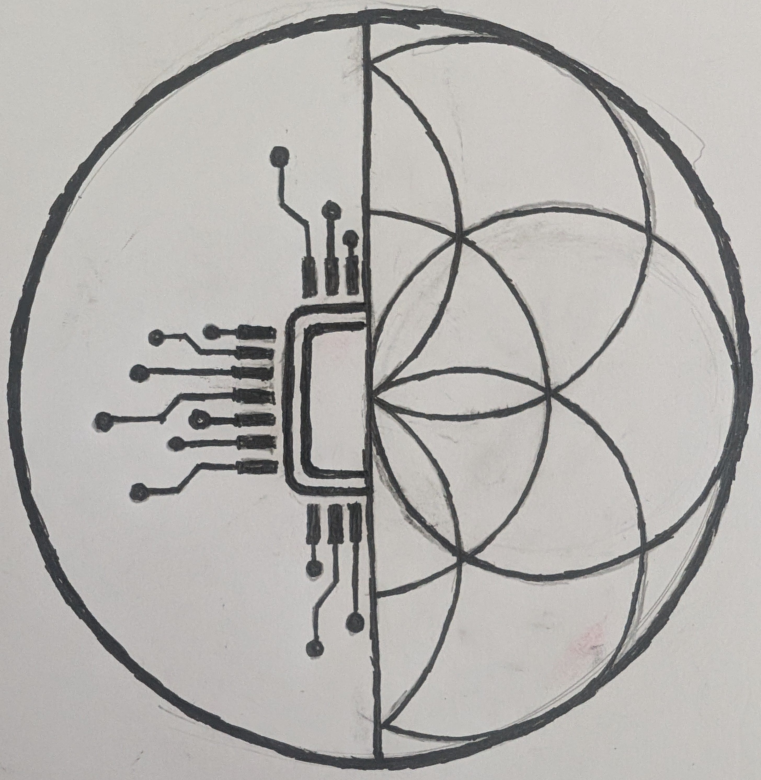
The hemispheres were completely disjoint and the design wasn’t at all showing the bridging of the mundane and the mystical. Instead, it felt like jamming two things together that didn’t belong and trying to reconcile them into one shape.
It then dawned on me that this was showing the state of my current integration rather than the goal.
I didn’t even finish filling in the left side to balance it out because there was no way for the sides to properly synergize. No amount of filling in the gaps could force those two halves to belong together.
Take 2
I flipped to a new page in my sketchbook to try again.
This time, I used the Seed of Life in its entirety as the base rather than cutting it down the middle, sketching it lightly with the mechanical pencil.
As I looked at it, I began to sketch in intersecting lines radiating from the center and added another circle near the outer edge to bisect more of the natural intersections. From there I added concentric circles to the middle, causing it to look like a target (which I’m realizing now is on-brand for me with my goal-oriented thinking). Yet this also seems to work as ripples radiating from that same center. The radiating lines also started to look like guide lines (rather than the dividing lines I drew over the Seed of Life). I used these guide lines to try to clean up the circles a little more.
I then added details to the edge of the circle to make it look more like those protractors we used in school to draw or measure specific angles for geometry. I didn’t intentionally decide on a number of notch lines to draw per “slice”, but it ended up being 8 which just felt “right” for lack of a better word. Though, in retrospect, had I done 9 there would have been 108 notches along the edge of the circle, but that would have required more intentionality than just cutting the “slice” in half like I was doing repeatedly.
Finally, I wanted the left to be more representative of the “technical” side of things, so I went in with the pen over the sketch lines of the protractor to make it the dominant element. I did the same on the right, but with the Seed of Life instead. What resulted was a design that actually felt like a bridge, an integration of the two hemispheres.
But then I erased the sketch lines.
What resulted felt… incomplete, like it had the same issue as the first image, just to a less extreme degree:
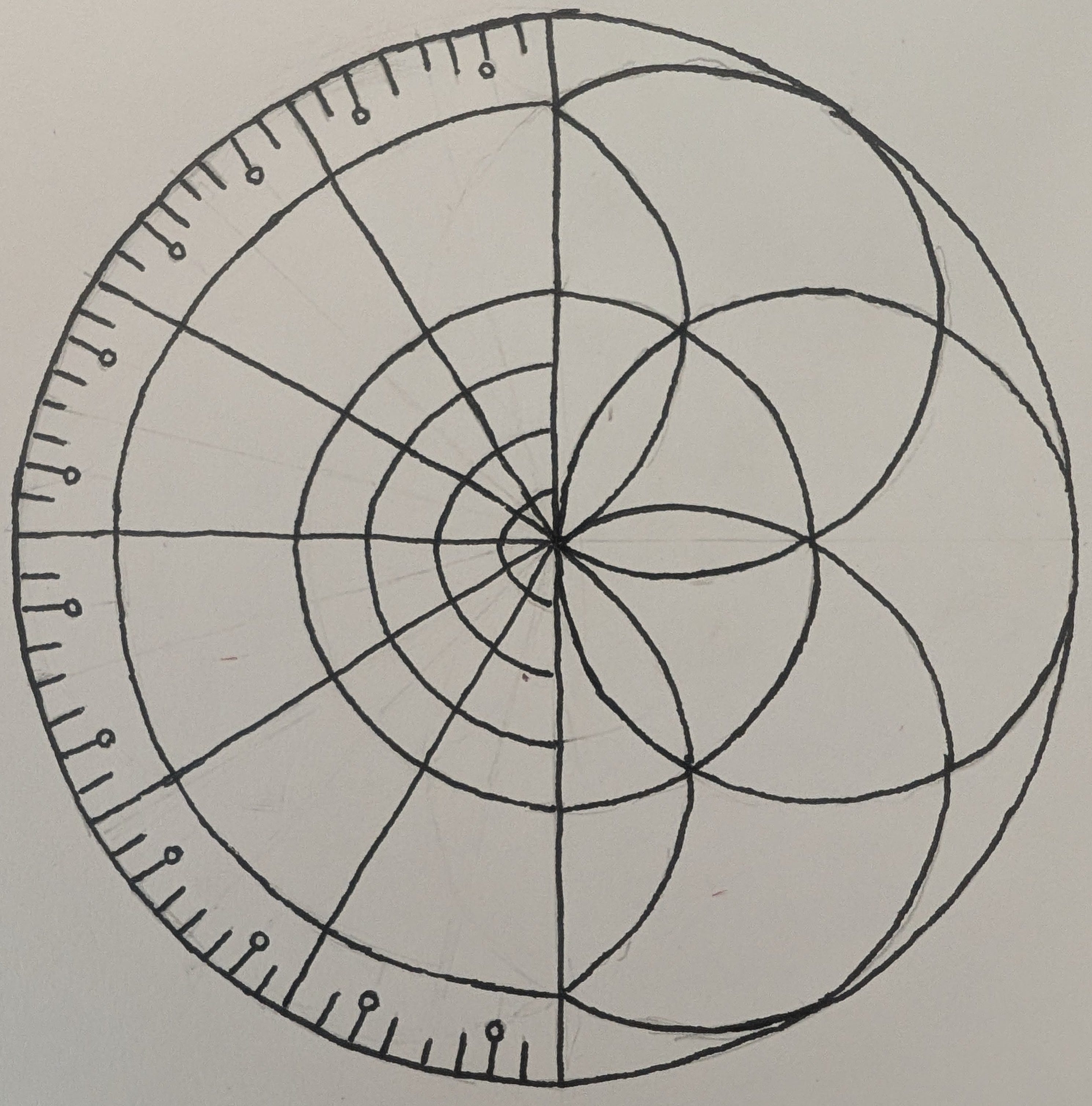
I had erased the process, the thing I was supposed to be documenting in the first place to show how the two were integrated. The “messy middle”.
I realized I needed to add the pencil lines back in so I did so intentionally and added the notch lines and ripples to mirror the left side. Then I realized it was actually done:
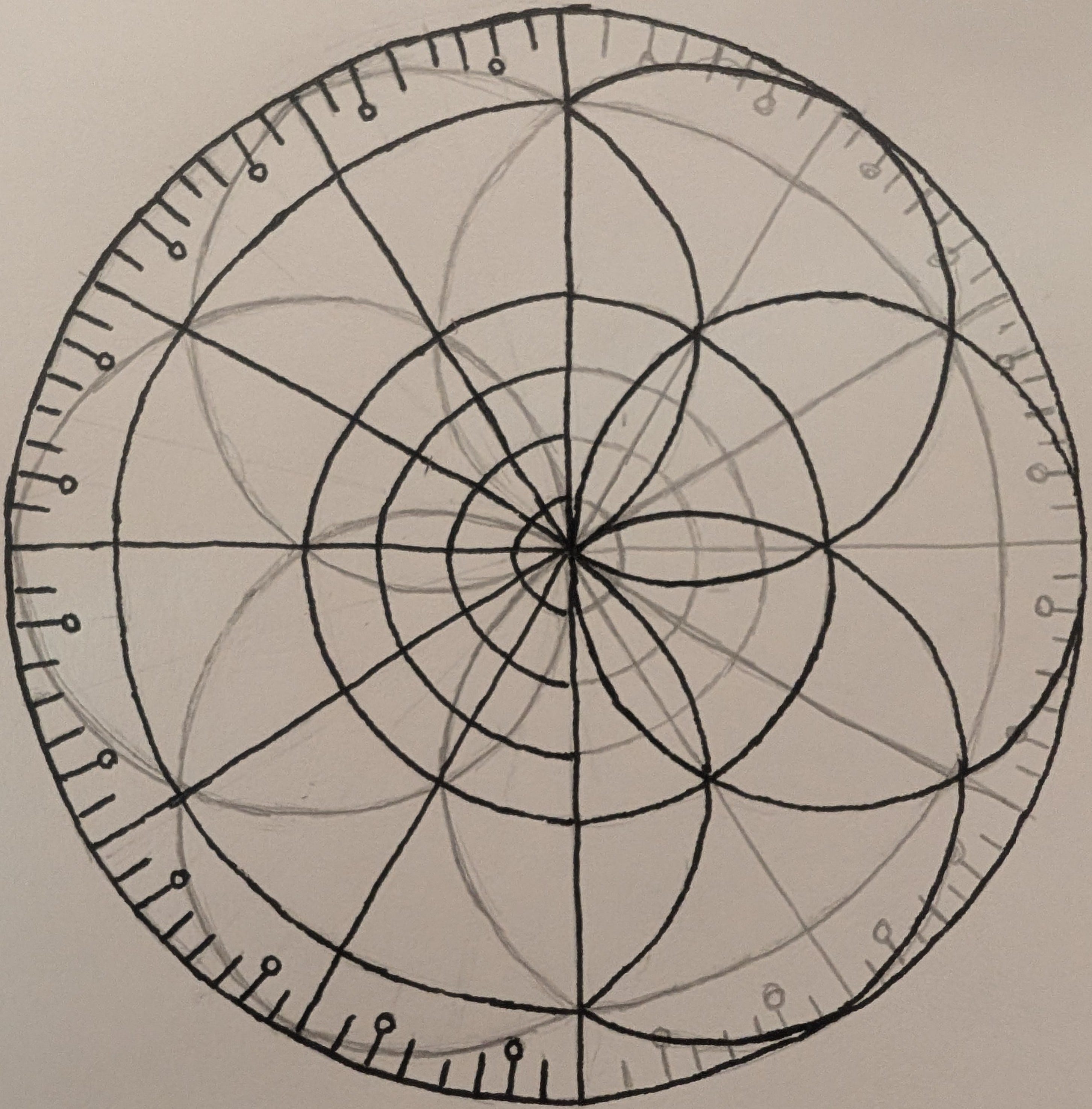
Although the line work isn’t perfect, I think it fits to show the “messy middle”, the idea of the goal in the absence of the tools to perfectly achieve it (if such a thing can be truly done).
Reflections
It’s strange how even simple sketching sometimes reveals more than expected. Swiss psychologist Carl Jung (cool dude, I enjoyed his Red Book) drew mandalas to map the Self. I didn’t realize I was doing the same thing until I sat down to write this post and tried to explain what I’d drawn. I was apparently drawing a mandala of my own becoming.
Take from that what you will about the drawings above. My take? I still have a lot to learn. But at least now I know what integration looks like, even when it’s imperfect.